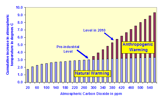
First, global warming is what happens between ice ages. This is a fact, whether humans are on the planet or not. The data on the graph is exaggerated by 4,900%, which I'll get to at the end. Second, historic atmospheric CO2 level increases have very often not correlated with increases in atmospheric temperatures. Assuming a linear increase in atmospheric CO2 levels it looks like we might be close to reaching where C02 was 30 or 40 million years ago in the next one or two centuries, but associating that with a "hothouse" is a specious argument. Please also note that current CO2 levels are near planetary minimums over the last 500 million years. Third, we know that Antarctica has been ice-free over 60 times, the last big melt being just over one million years ago. Between glaciation cycles, which do not always occur with ice ages, sea levels rise and fall up to 200 meters (600 feet), and this is consistent with what we are seeing now, which is a 300 foot rise in sea levels since the end of the last ice age approximately 12,000 years ago. It is entirely possible and consistent with geological history that Manhattan and Florida will be under several hundred feet of sea water again, as they have been many times in the past before humans walked the earth. On this point, lots is being made about the Antarctic ice sheet breaking off and raising ocean levels. Let's be clear, the ice sheet is already floating on the ocean, so its melting isn't going to raise ocean levels one inch. Ignoring the facts for the hype is journalistic and scientific malfeasance. When Greenland and the Antarctic land mass are ice-free, that will raise ocean levels as it has many times in Earth's geologic history. Fourth, long before humans arrived on the scene CO2 levels were much higher, and current land temperatures and deep ocean temperatures are the coldest they've been in 500,000 years and 65 million years, respectively. Finally, and most damning for the "hothouse" graph is that they commit scale exaggeration of 4,900% to scare the math illiterate. To be clear, the graph changes scale from tens of thousands of years to hundreds of years at the far right of the X-axis. Specifically, it changes from 15,000 years to 300 years to falsely magnify short-term trends in atmospheric temperature, which are largely driven by La-Nina and El-Nino driving short-term ocean temperature changes. This is journalistic and scientific game playing to push a pre-determined conclusion.


